What Happens When a Designer Goes to Rehab?

“Crystals, sacred geometry, and soul searching all come-out of the closet in rehabilitation.”

Barry Lai, Creative Director of Design Rehab
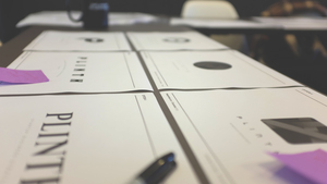
Switching careers and launching a new venture can sometimes be personal and a moment of self-reflection. Plinth enlisted Design Rehab to get a birds eye view from an objective source to design their branding. I sat down with Barry Lai, creative director of Design Rehab and Plinth's founder Desi Danganan to get the lowdown on Plinth's design rehabilitation.
WHY DID YOU CHOOSE TO WORK WITH BARRY LAI OF DESIGN REHAB?
I’ve known Barry for probably a decade and saw his work for The Riottt and various other projects. One of my best friends who’s also a designer worked with him at a start-up and always spoke highly of his work.
Drugs are expensive. Inspiration is free.
It wasn’t until he started Design Rehab and created the branding around it I knew that I was gonna work with him. The tagline "Drugs are expensive. Inspiration is free" spoke to me. The whole concept of coming in for rehabilitation was simply genius!
“Being a nightlife veteran and serial entrepreneur looking to go into a new direction made me a perfect candidate for Design Rehabilitation.”
— Desi Danganan
BARRY, WHY DID YOU WANT TO TAKE DESI ON AS A CLIENT?
As mentioned, Desi is a longtime friend. He’s always been on the vanguard of doing things in the city that excites the community. I’ve always been a fan of his establishments and thought process. Ultimately, I saw this as an opportunity to work with a likeminded individual and see what comes of it.
DESI MENTIONED HE CAME TO YOU AS A BLANK SLATE. BARRY, HOW DID YOU APPROACH THE PROCESS?
My process with Desi was to build on core fundamentals of discovery. Figuring out the demographic his business is attracting, research the competitive landscape and listen to what he has to say about his business.
We really did start Carte Blanche. We didn’t have a name and after going through the initial client learning phase, together we developed a fundamental key word grid and pulled all words we felt appropriate and narrowed it down like a Final Four bracket.
“Plinth, a simple one-word moniker with emphasis on fundamentals.” — Barry Lai
“I turned out to be the nightmare client! ” — Desi Danganan
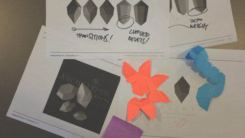
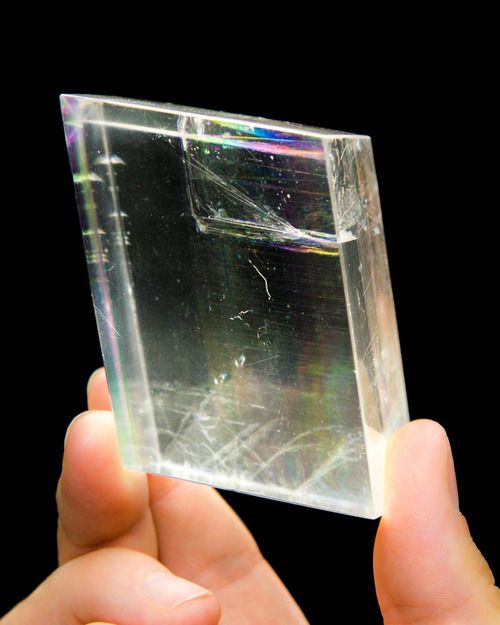
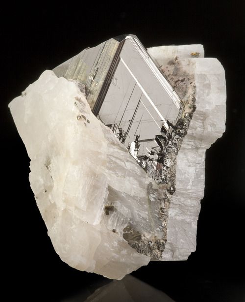
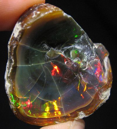
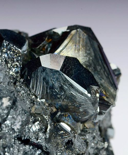
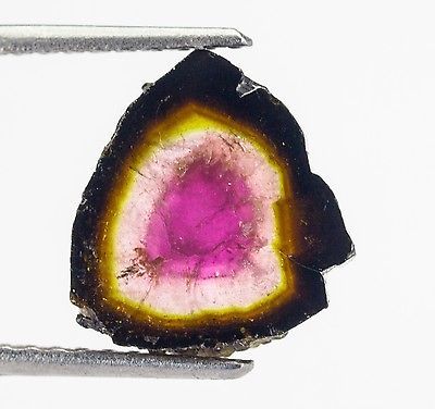
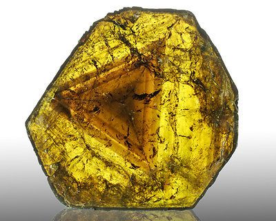
Once we figured out the name, we dove into form and type studies, obsessing over everything from incremental shifts in vector points to stroke weights in lines. I applied a “mild” to “wild” approach to gauge where Desi’s mind was in terms of concept and form. We derived inspiration from geometric shapes, planes, crystals and origami. This was definitely one of the more involved projects that exercised the mediums taken to express a thought.
DESI WHAT WERE YOUR IMPRESSIONS OF THE PROCESS?
Brands and logos are very personal. As a designer myself I shun away from logo / branding projects that haven’t been fully fleshed out. Clients sometimes have no idea what they want, or worse can’t agree amongst themselves.
Barry was super patient and helped me narrow in on what I truly wanted. He went thru 13 rounds and generated over 40+ logos! What should've been a 2 month project last 8 months. Lord have mercy--I would've fired myself if I were in Barry's shoes!
It’s not to say my team and I do not critique work frankly amongst ourselves, but to get a perspective from another designer with another (more personal) motive helps me understand what other designers want. It was ultimately enjoyable because feedback was never really subjective and every discussion had a start and a endpoint.

DESI, WAS IT DIFFICULT TO COME TO A FINAL DESIGN?
Every round Barry showed me help me clarify what I wanted Plinth to be. In architecture, a Plinth is the base of a column. I wasn't satisfied with that definition and how that was translating visually. I didn't want my new venture to be on the bottom and wanted it to be much more. Then I had a break thru in the 7th round after going to a crystal show and realized that
“ I wanted Plinth to be a representation of a magical element…” — Desi Danganan
Kinda like an energy cube you would insert to a business to make it grow. I know this is far fetched, but at an abstract level you have to think of what your brand represents and at a more granular level how that can be communicated.

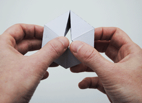
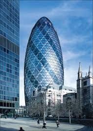
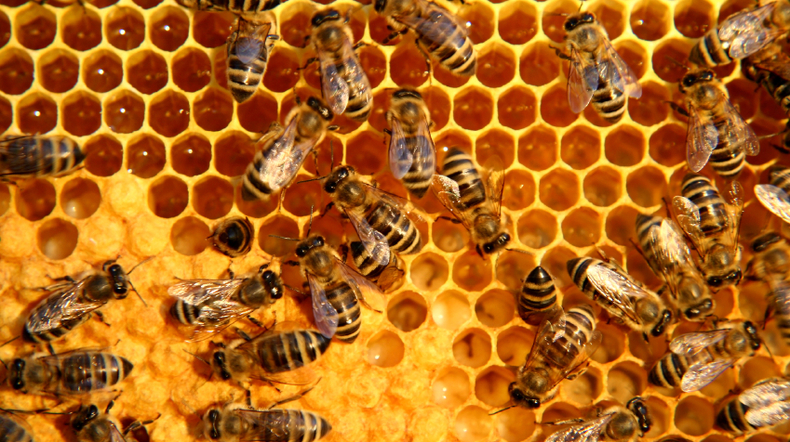
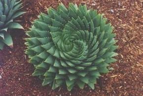
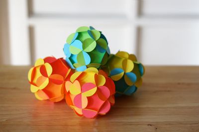
I’ve always been fascinated with geometry, fractals, and the idea of repeating patterns in nature. So we conducted a study on tessellations which are a tiling of shapes that have no gaps and in architectural terms can be used to create all kinds of three dimensional shapes.

Barry came-up with a mark that conveyed the 3 main components of the business: design, strategy, and execution while visually demonstrating how
“One shape can form the basis of something much more complex—like taking an idea and developing it into a business. ”
— Desi Danganan
IT SOUNDS LIKE DESI WAS GOING LEFT-FIELD, BARRY HOW DID YOU MANAGE TO DISTILL ALL OF THESE IDEAS INTO A TANGIBLE BRAND?
It really wasn’t too left-field. I think we are the same brand of “crazy”. Within each working relationship, may it be personal or professional, there’s a give and take. There will be moments I spoke and Desi listened and of course moments that Desi spoke and I listened. We ultimately had a common goal and it was to achieve the highest aesthetic and most appropriate mark for a in-demand business like Desi’s - and make it just conceptual enough that it carries weight even without heavy explanation. The process, though long was well worth it.