Ju-Ni: Communicating A New Michelin Star

Communicating a Michelin Star in 12 bites.
Background
2016 SF Chronicle Rising Star Chef, and 2017 Michelin Star Chef Geoffrey Lee and business partner Tan Truong created Ju-ni to craft an elevated sushi experience in an atmosphere that is both intimate and approachable. The word "Ju-ni" means 12 in Japanese and it reflects the restaurant's 12 seats and 12 course omakase menu.
With awards and media attention pouring in only months after they opened, Ju-ni came to plinth to create a website that reflected the Ju-Ni experience.
Objectives
Establish the foundation for the Ju-ni brand.
Communicate what separates the Ju-ni experience from many other sushi restaurants.
Design a web experience that is optimized for mobile.
Create assets for use on social media.
Strategy
Position Ju-ni as a place that sells an unforgettable moments not just sushi.
Mimic Ju-ni's 12 course omakase experience by designing a website that tells a powerful story in 12 photos and phrases.
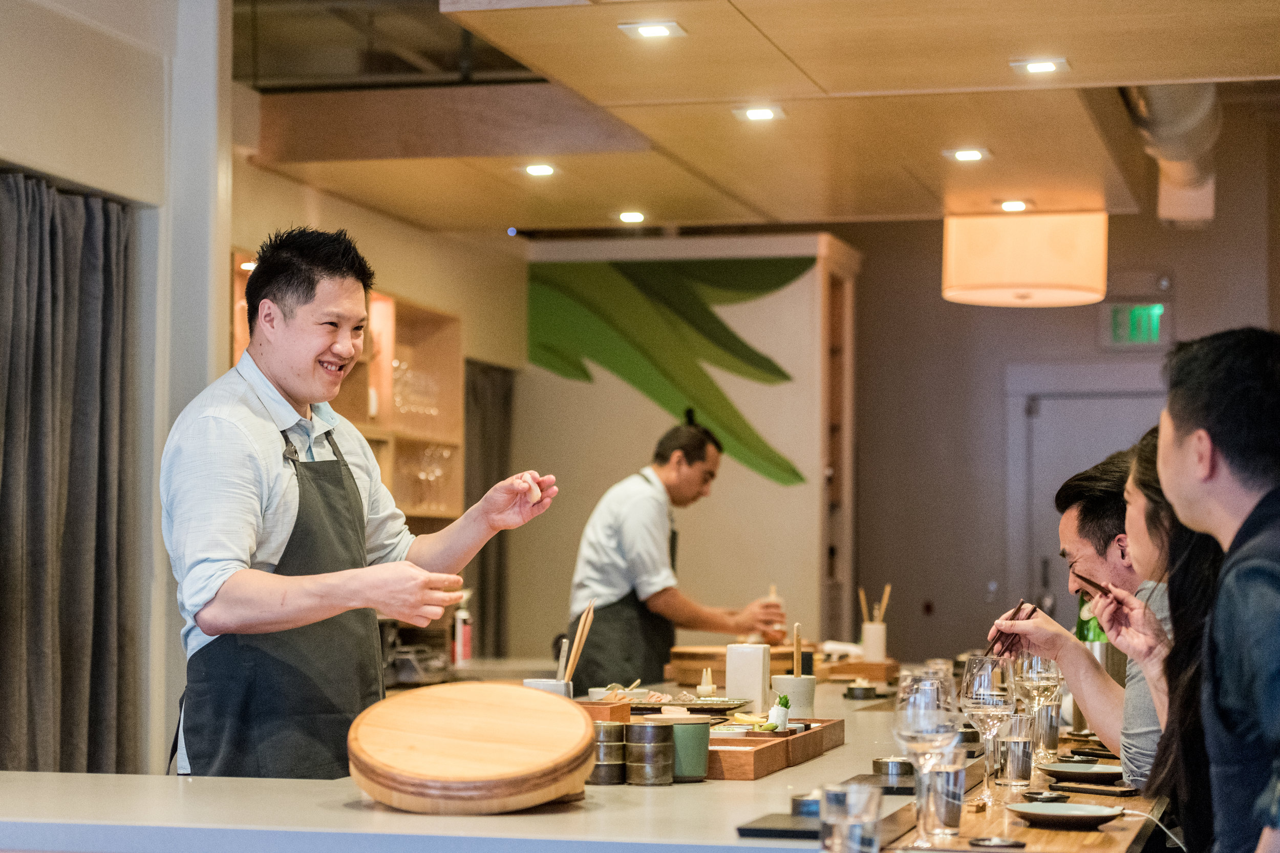
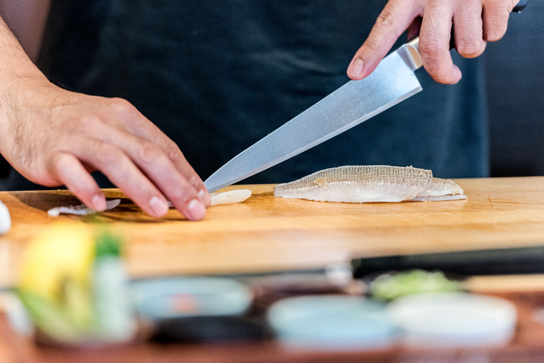
Commission photography that captures the process, unique moments, as well as food.
Develop custom illustrations for social media to stand out from a sea of photos.
Brand Exploration
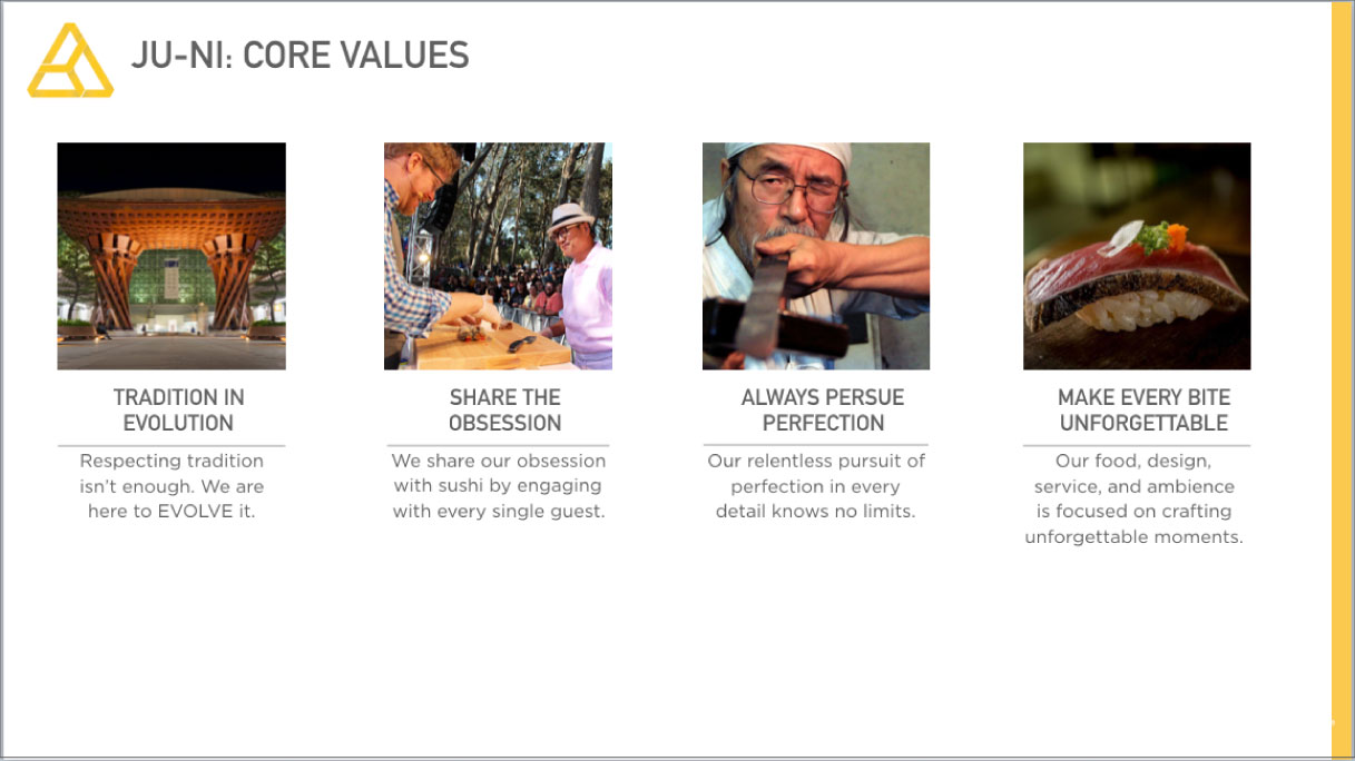
We interviewed owners chef Geoffrey Lee and Tan Troung in order to dive deep into their story and philosophies. From our exploration we distilled Ju-ni's core values and established a foundation for their verbal identity.
Ju-Ni doesn't make sushi, they create memories from unforgettable moments.
One of the perks of developing the branding and website for one of SF's hot new restaurants is being able to experience what sets them apart first hand. After having dinner at Ju-ni, we were discovered the essence of what they were selling -- a relaxed omakase experience filled with unforgettable moments.
The orchestration, camaraderie, creativity, and obsession with craft was our challenge to convey.
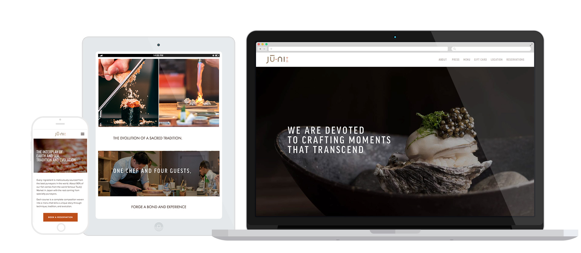
DESIGNING A WEBSITE THAT EMBODIES A MICHELIN STAR OMAKASE EXPERIENCE ONLINE AND ON MOBILE
Our strategy for conveying Ju-ni's experience online was to use a combination of photos and poetic copy into 12 bite sized sections. We commissioned photography from the Pork Belly Studio to capture the scenes of unique moments diners would experience as well as food shots.
We designed the website to be optimized for mobile and in a format that conveyed the Ju-ni experience as potential customers scrolled down.
CUSTOM ILLUSTRATIONS TO HELP JU-NI STAND OUT ON SOCIAL MEDIA
These days restaurants and their customers take great food shots to post on their social media feeds. To help Ju-ni stand apart in a sea (no pun intended) of food photography we developed custom illustrations of the ingredients used by the chefs.
The illustrations mimicked the traditional Japanese Gyotaku style of painting that fisherman used to use to record their catches.


