Ozumo

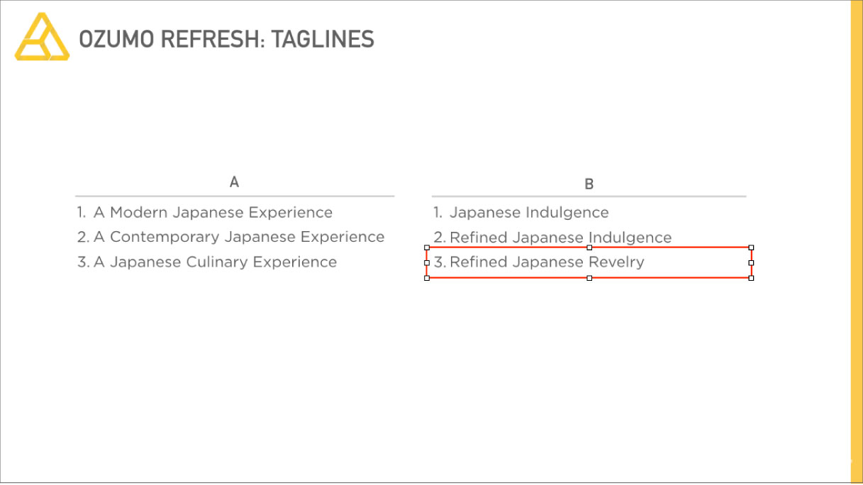
Refined Japanese Revelry
Background
Ozumo has been an institution in San Francisco's culinary scene for 15 years which is an eternity in todays ultra competitive restaurant business. Ozumo has grown to include Ozumo Oakland and other concepts in southern California. Needless to say they were growing and growing fast.
Ozumo came to Plinth because they wanted to give their website a newer look and feel. After meeting with Ozumo, we realized that a growing company like this needed more than a new look to convey who there were, they needed to establish their brand.
Objectives
- Update Ozumo's website
- Re-fresh Ozumo's brand
Strategy
- Discover Ozumo's brand values and create a brand voice that would help them stand out from the rest.
- Re-fresh their overall design to represent their brand while keeping elements of their successful history.
- Create a new website the reflects the experience that Ozumo provides.
UNCOVERING CORE VALUES AND CREATING A BRAND'S NORTH STAR
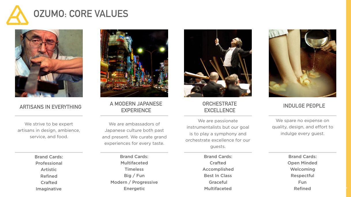
Many business can be successful without building complete a brand but Ozumo had plans to grow and needed to tell the world what they stood for. Although many owners have an instinct as to what they're core values are, establishing them in a concrete way helps create a company's north star. By north star, we mean a guide which makes keep the companies mission and soul in mind whenever they make decisions.
Ozumo 15yr Commerative Video
After speaking with Ozumo and going through some brand exploration exercises we, established their core values.
After digging deep into what Ozumo was offering customers, we came to the conclusion that Ozumo was much more than what their tagline and design was communicating. Their original logo and website design communicated "Contemporary Japanese Cuisine".
Our solution was to highlight how Ozumo offered more than any other Japanese restaurant. Ozumo offered robata, sushi, specialty items, and a sake lounge where people can gather and enjoy. Ozumo was more than a meal, it was a complete indulgent experience.
VERBAL IDENTITY
While a new design language affects how people see a brand, it's equally important to establish a verbal identity to ensure your brand gets heard. We updated Ozumo's tagline from "Contemporary Japanese Cuisine" to "Refined Japanese Revelry" to reflect their new positioning. The copy on the website focused on conveying the complete experience instead of solely on food.
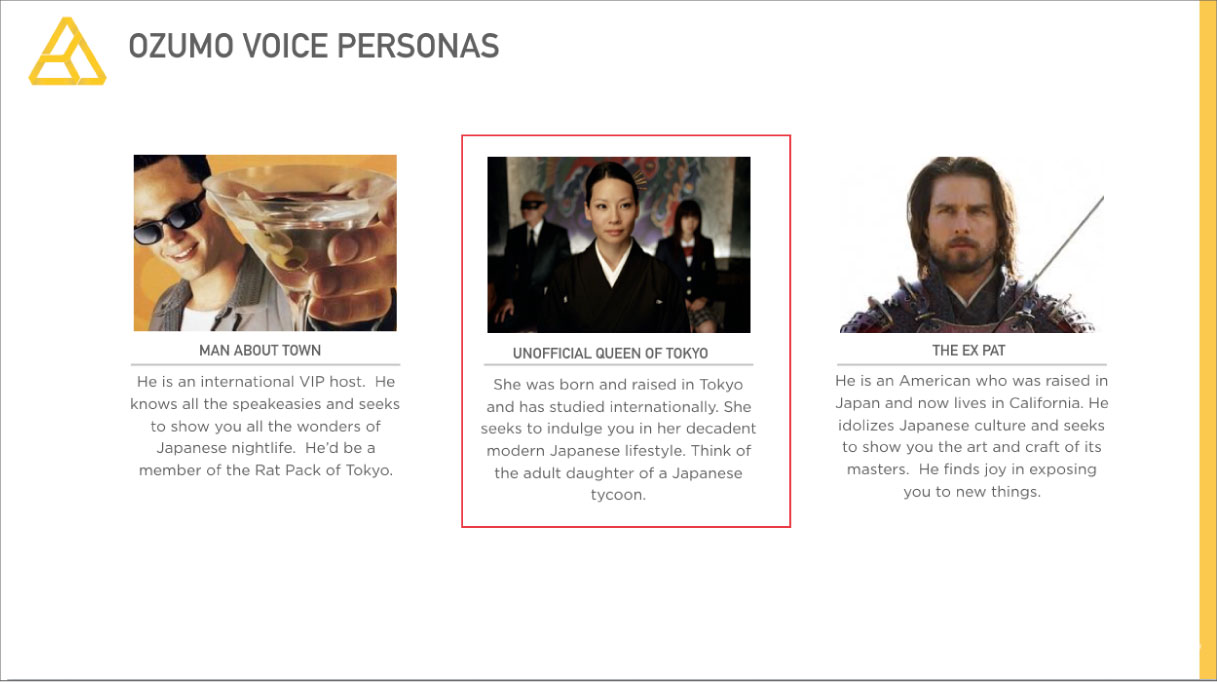
Based on this new direction and the brand values we uncovered, we created a new anthem for Ozumo.
DESIGN SOLUTIONS
Ozumo's new logo paid respect to their old logo while giving it a modern spin. We took inspiration from Japanese Family Crests and incorporated the "Oz" form from the logo they had used for 15 years.
Original Website
For the website we wanted to elevate the online experience to represent the modern luxury of the real life experience. The old website showed close up food photography on a sterile white background.
A Fresh New Look and Feel
For the new website we used photography to put focus on Ozumo's main competitive advantage, the complete experience. We used a black background to convey sophistication and indulgence while putting equal focus on the components of the experience: ambience, craft, and revelry.


