FK Frozen Custard

Re-Branding a Company Poised for Growth
BACKGROUND
FK Frozen Custard (formerly Frozen Kuhsterd) began in 2011 as a stand at the Underground Market in San Francisco. By 2012, they became California's first frozen custard food truck and one of the highest rated on Yelp. The company was growing fast and they came to Plinth to develop a new website. Along the way they realized that they needed to re-fresh their brand.
Before
FK's original brand direction tried to appeal to the kid in everyone. The font, illustration and colors provided a very child like brand identity.
In an attempt to differentiate themselves, they used the phonetic spelling of custard "Kuhsterd" with often times created confusion in the eyes of customers.
After
Positioning
With flavors like Port Wine Strawberry, Thai Tea, and overall propensity to push the flavor envelope, we learned that FK wasn't appealing to kids. They were appealing to young adults and foodies. From there we decided to take the brand in a direction that best represented who they were, and who they were growing to be.
Visual Identity
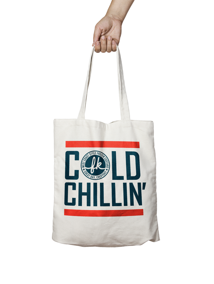
FK was taking a classic midwestern treat and adding an all natural, gourmet, "West Coast" twist. The new color palette we developed was a slightly modern take on red, white, and blue. We altered their mascot to read less like a cartoon character and more like an icon that they can use as a stamp as they extend their brand.
Verbal Identity
Frozen Kuhsterd confused customers and we had to remedy that. After a few brain storming sessions we decided to rename the brand "FK Frozen Custard". The moniker "FK" paid homage to the roots of their company, but also gave it a handle. It also allowed the FK brand the flexibility to extend into other dessert categories.
We also gave Kevin a fresh, slightly mischievous voice that would resonate with customers make them stand out from the rest of the dessert segment.
Website
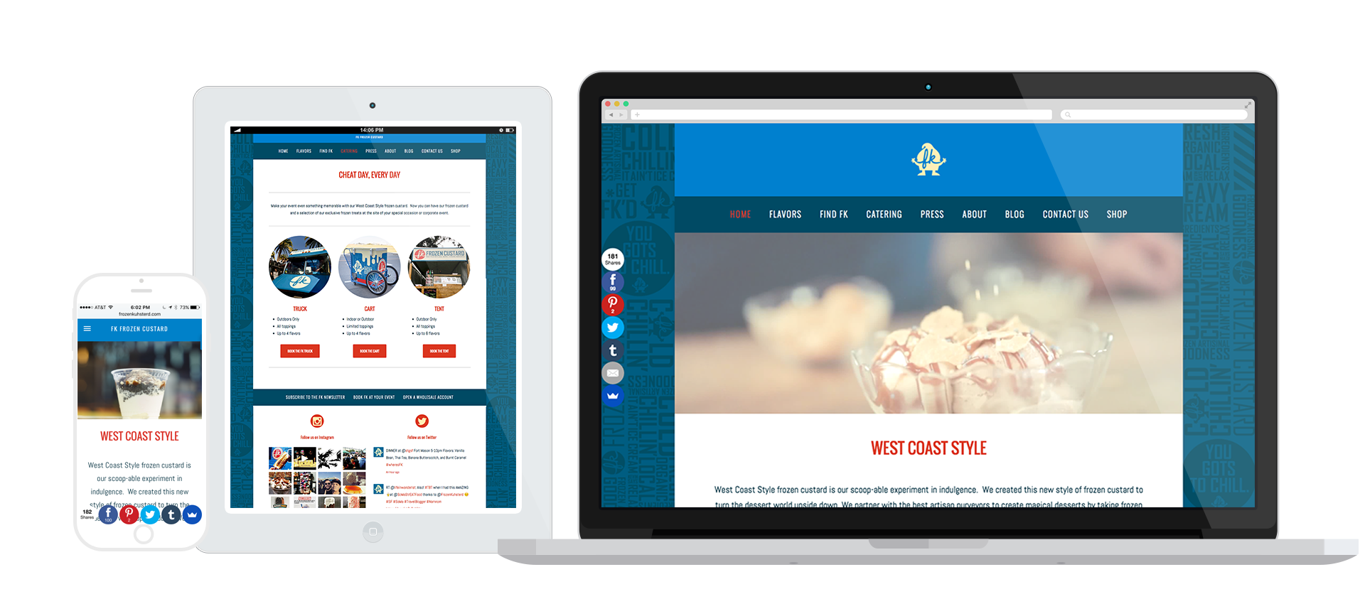
FK's new site appealed to young adults and foodies alike with slogans like "Cheat Day Everyday" and more modern design. Since a majority of their users used mobile devices to view their website we made sure that it was optimized, easy to read, and communicated with great photography and a high impact video background.


