Señor Sisig: Mobile Optimized Website + Branding

Growing a Food Truck Empire with a Website That Expands Your Brand and Lets People Know Exactly Where You Are.
BackgrouNd
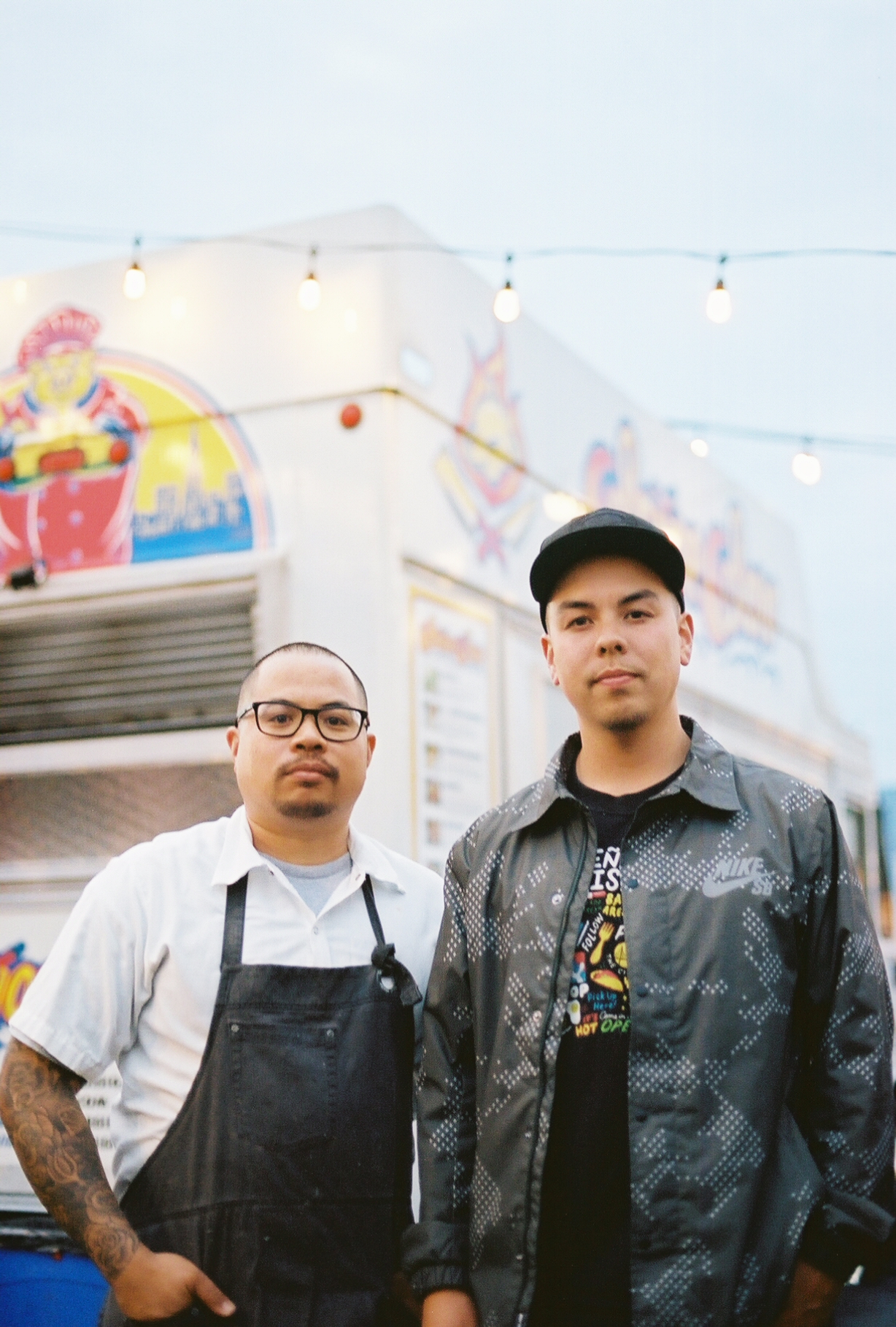
The partners Gil Payumo & Evan Kidera
Señor Sisig started with 1 truck in 2010. High school friends Evan Kidera, who has an MBA from San Francisco State, and Gil Payumo, an experienced chef, saw Filipino food as a Bay Area cultural force ready to break out.
In 2017 Señor Sisig had grown to a fleet of 5 trucks, been featured on the Food Network, and was named “Top 10 Food Trucks in the Nation” (2014) by Fox News.
Señor Sisig turned to Plinth to create a website that could help grow their business and truly represent their brand.
OBJECTIVES
Develop a website that showcases the vibrancy of their food, helps people find where they are, and facilitates the growth of the catering portion of their business.
STRATEGY
Explore and develop the Señor Sisig brand fundamentals.
Create design assets that convey the brand throughout the new website.
Design a website that further communicates Señor Sisig brand and grows their business with new sections including: online ordering for catering, merch page, and advance mapping function.
Develop a mobile user interface optimized to help users locate multiple Señor Sisig trucks at any time.
BRAND FUNDAMENTALS
People resonate deeper with brands that have a sense of personality and purpose. Prior to beginning any design work, we did a deep dive with Evan and Gil to extract Señor Sisig’s core values and brand persona.
Together with Evan and Gil, we developed the 4 core values that the Señor Sisig brand would stand for.
The brand persona inspiration board and profile provide strong reference points as to “who” the brand is.
Explicitly establishing Señor Sisig’s core values and personality helps the business maintain the consistency crucial to developing a brand that relate to.
Branded ILLUSTRATIONS
From the beginning, Señor Sisig had an established illustration style with their logo type / mark.
To give their website more flavor we created new custom illustrations matching the Señor Sisig style drawing inspiration from traditional taco trucks, Philippine Jeepneys, and Bay Area street art.
WEBSITE
We designed the desktop version of the website with a white background to be consistent with Señor Sisig’s trucks and to allow the illustrations and food photography to pop.
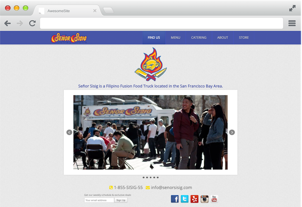
Before:
The Original Website
After:
The home page begins a high impact food video background and then immediately focuses on the two pillars of their business: the food trucks and their new catering program.
To increase catering orders, we created an online ordering page specifically for large party delivery and for pick up that was integrated with their new backend order system Spoonfeed.
OPTIMIZED FOR MOBILE
The core of Señor Sisig’s business is food truck sales. With 5 trucks roaming throughout the Bay Area at any time of the week, the mobile version of the website focused on where to find the trucks.
For mobile, we created a custom user interface incorporating GPS location services and a Google Maps overlay which marked where every Señor Sisig truck was at the moment, where they well be in the future, as well one click directions from wherever the user is.


